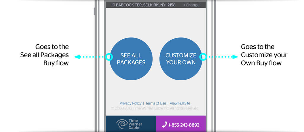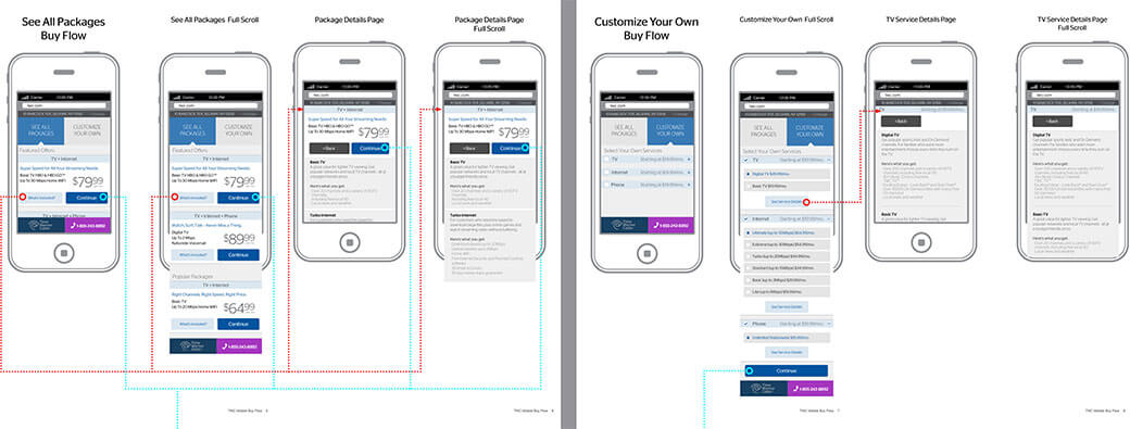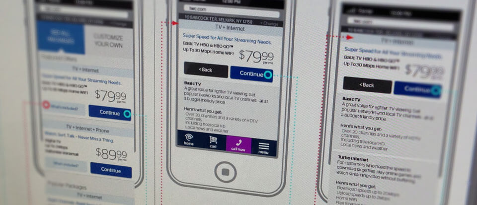
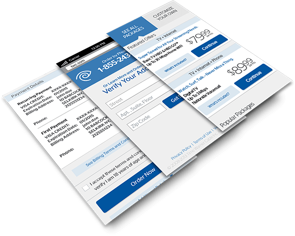
Mobile app designed to improve the experience of purchasing home internet and entertainment, an otherwise complicated task. Making the experience seamless, smooth and painless.
Remove the Clutter
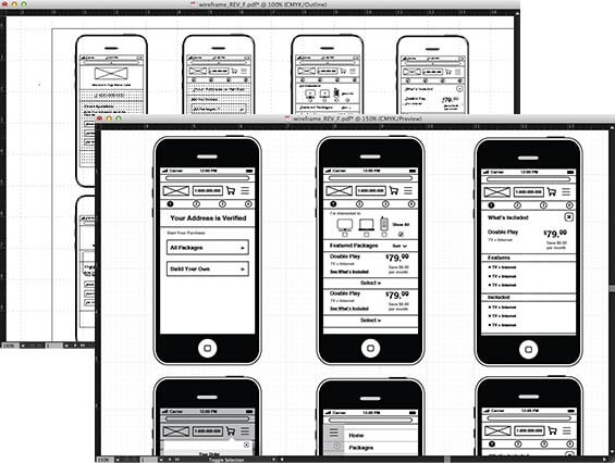
By removing the clutter, the experience becomes smoother and the focus is clearer. The same is true before adding in color and typeography. The layout has to make sense before any design takes place.
Everything at your fingertips
Button placements that make the most sense for both the user and the on screen elements. Hierarchy defined by typography and aided by color.
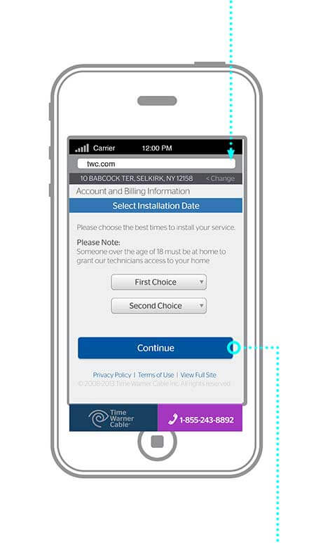
Text input or dropdown?
A choice has to be made for the type of input that’s actually needed to get user input. Here’s a case where a dropdown list makes the most sense rather than having a freeform input text box. Makes sense for the back end code and for the user it’s simplifies everything with only a few taps rather than having to type every bit of info into the first and second choices.
