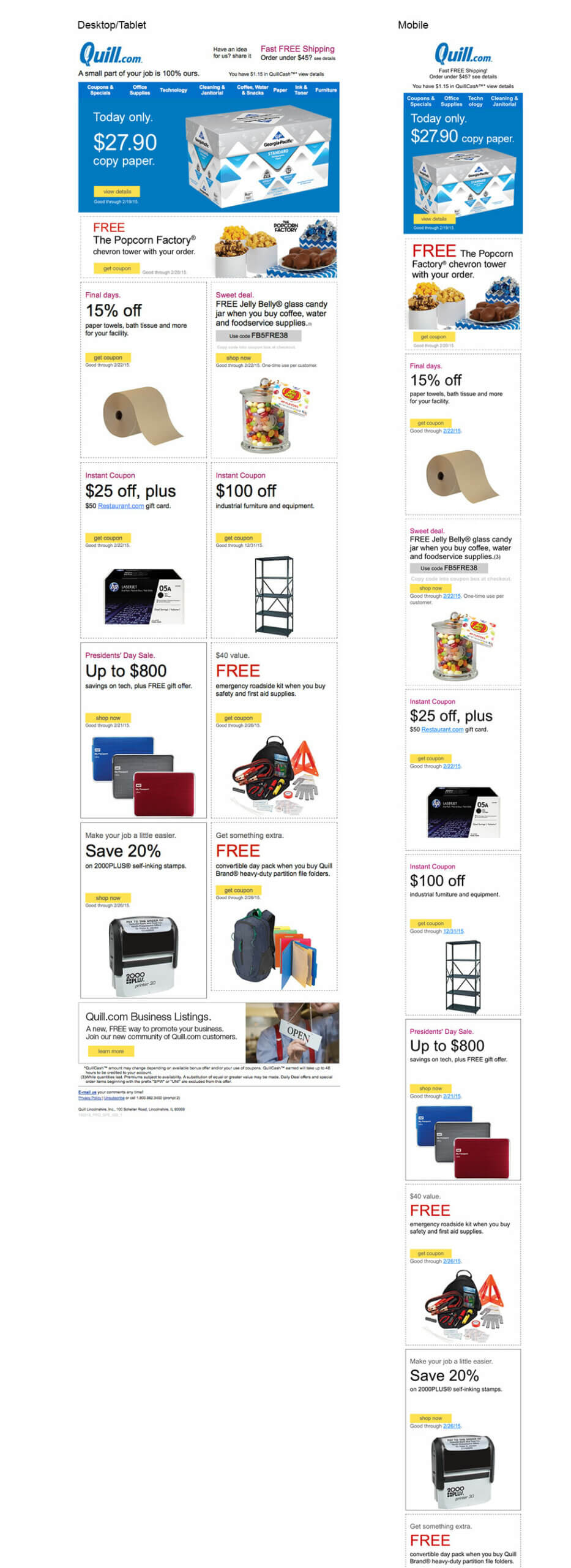
Take a responsive website and successfully display it across four major browsers and then display it across multiple e-mail clients inside those four browsers as well as their mobile versions then multiply that by the number of desktop e-mail clients.
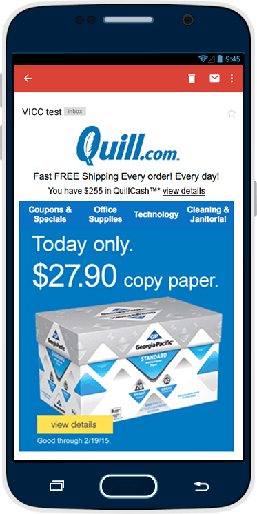
Mobile friendly layout made using mobile-first approach.

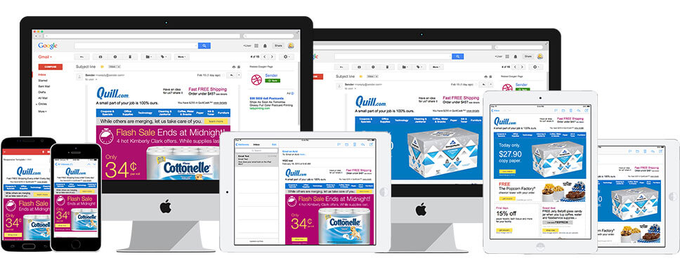
With so many devices available out there, e-mails are increasingly being viewed on mobile or tablet devices. For that reason, not only do e-mails have to be coded in a way that plays well across multiple screen sizes but also across multiple e-mail clients and multiple e-mail accounts on different browser types.
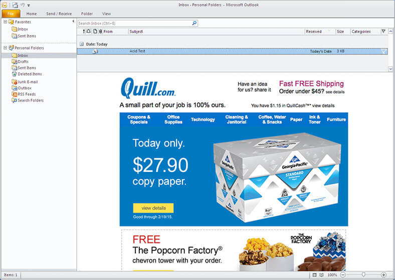
Yes, it looks good on Outlook too.