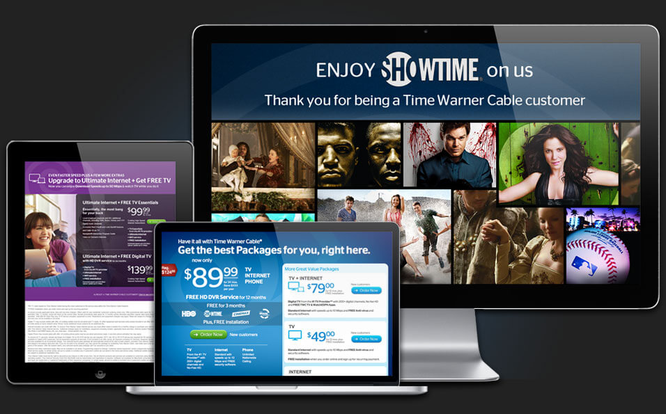
I had the chance to tackle several landing pages for Time Warner Cable. Each month, the company posted unique bundled offering and they needed lightning quick solutions to feature these offers.
It’s Showtime!
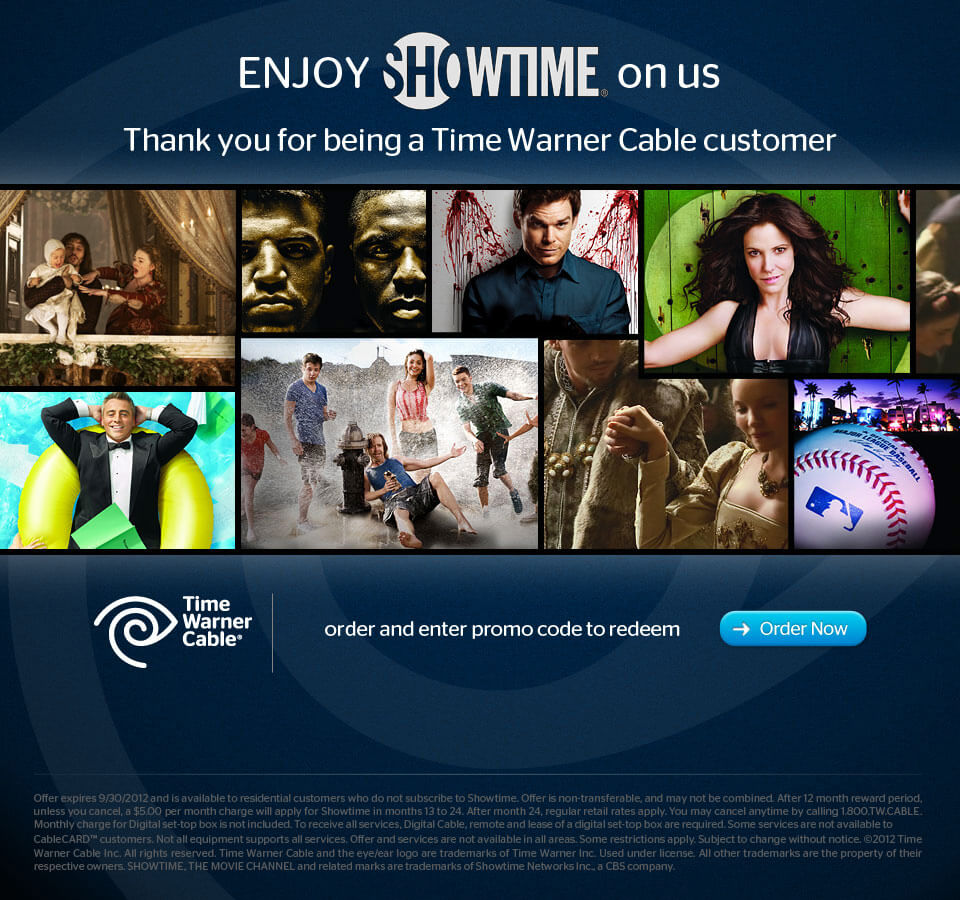
Showtime has a huge selection of hits and award winning programming. This is a good chance to show off Showtime shows and let it speak for itself.

Using imagery is a good way to inspire the viewer and add value to an offer.
Here, there are two price tiers but essentially the same offer. Rather than adding confusion to an already technically heavy text, showing the end results through compelling photography makes for a more lasting impression.
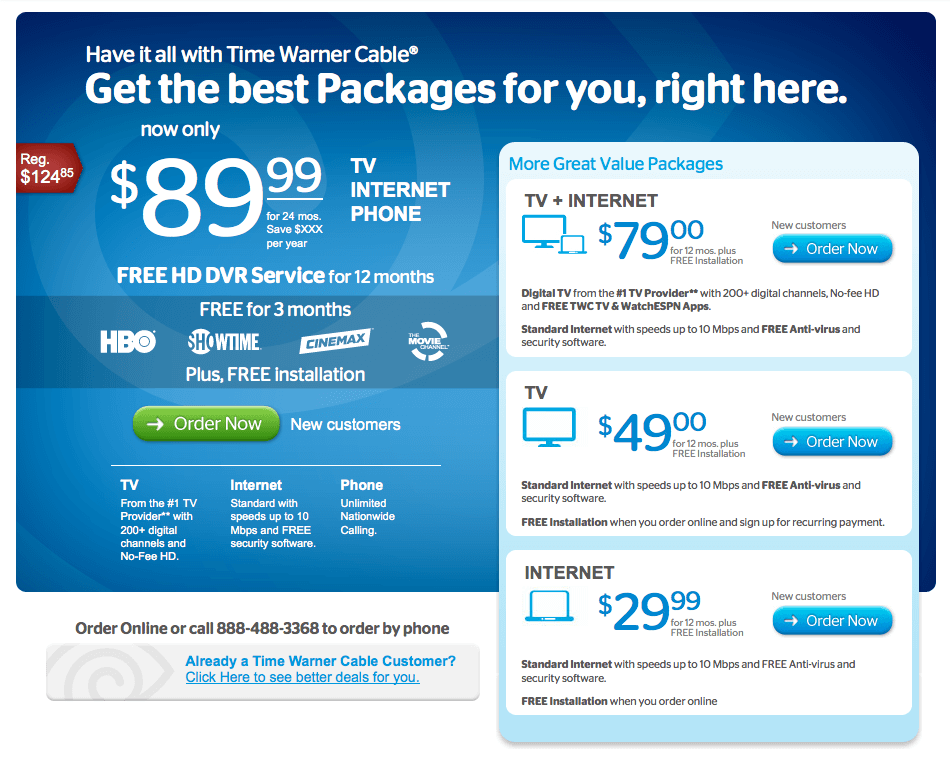
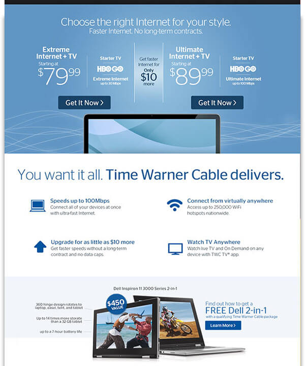
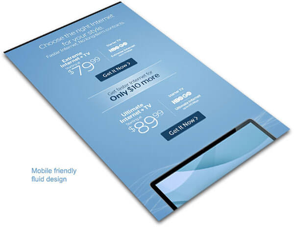
Have it all
Limited space called for a clever solution to add secondary offers in addition to a main feature offer so we can really have it all.
