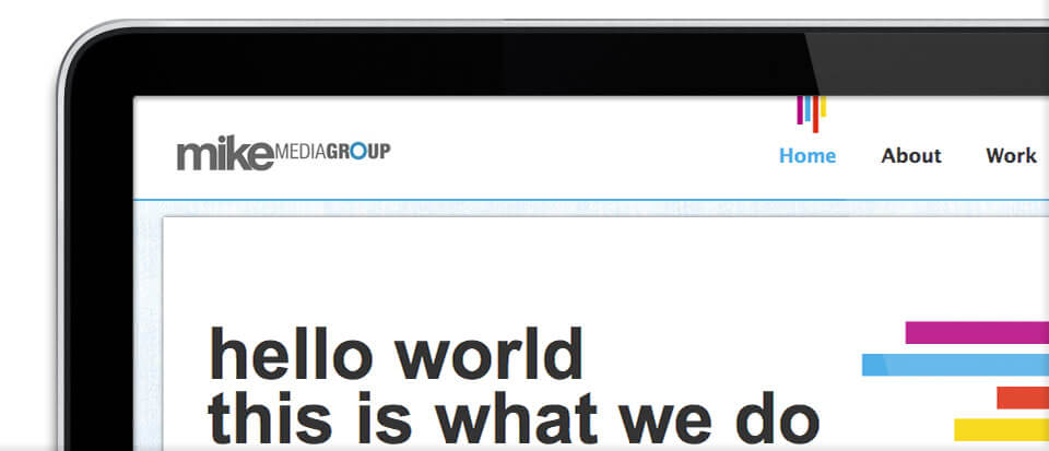
MMG is a small company that thinks big. Its small size in combination of the varied skill sets of each individual in the group makes for an incredibly nimble and successful team. We felt that the rest of the web needed to know this.
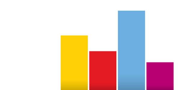
Colors
The use of colors add excitement and show diversity and also we wanted it to be friendly and inviting.
The colors were chosen to communicate the agility, intensity and somewhat funky essence of MMG as a group. It is intended to be smart, friendly and up to date with what’s expected in current industry standards.
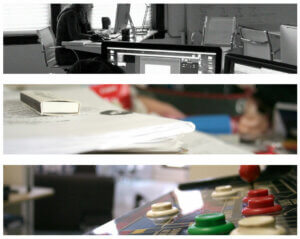
Using photos shows off the newly converted space and sets up the atmosphere, here are the select few that were taken.
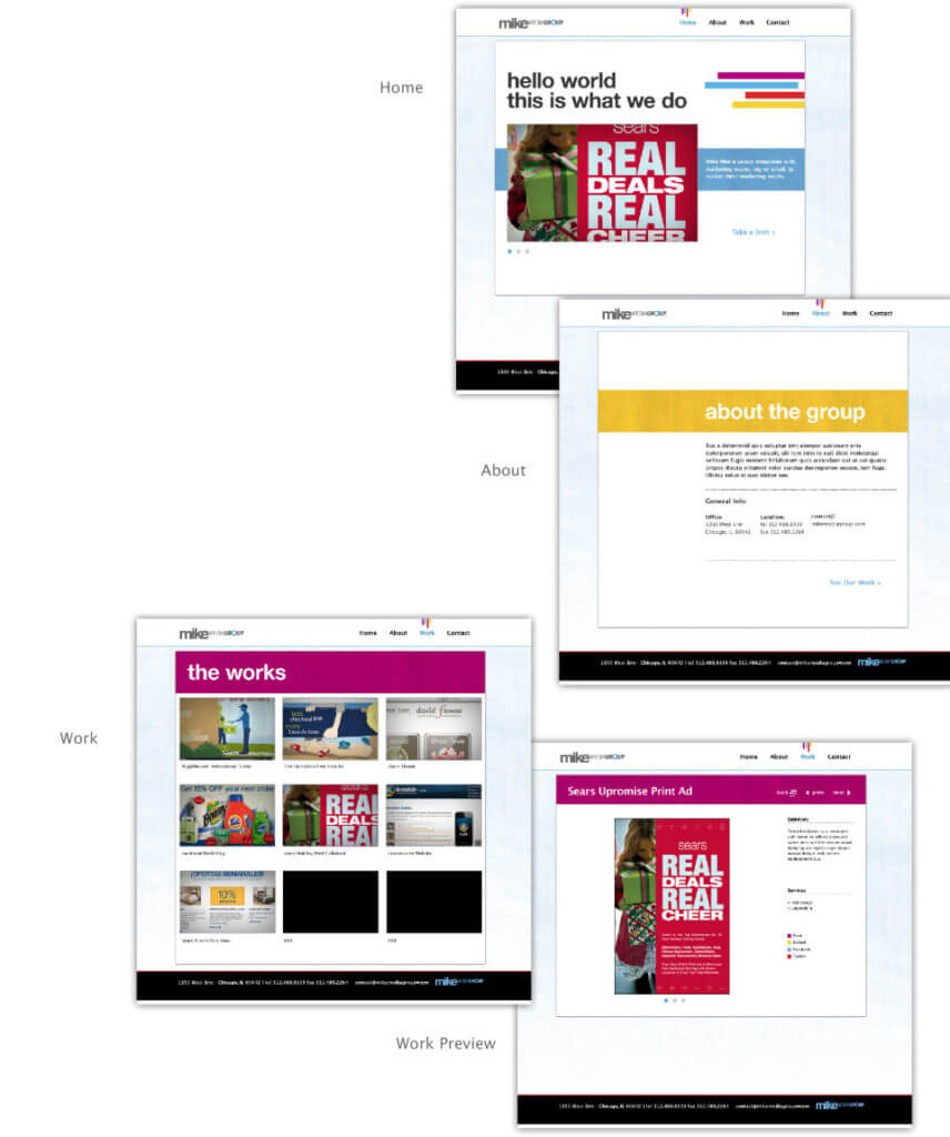
I had a lot of fun rebranding developing MMG and building the new site from the ground up. The logo received a much needed update and the color bars gave the design an extra push. The use of white space provided a more professional look and an openness. Ambiance photography showed personality of the studio for clients who may want to stop in.

